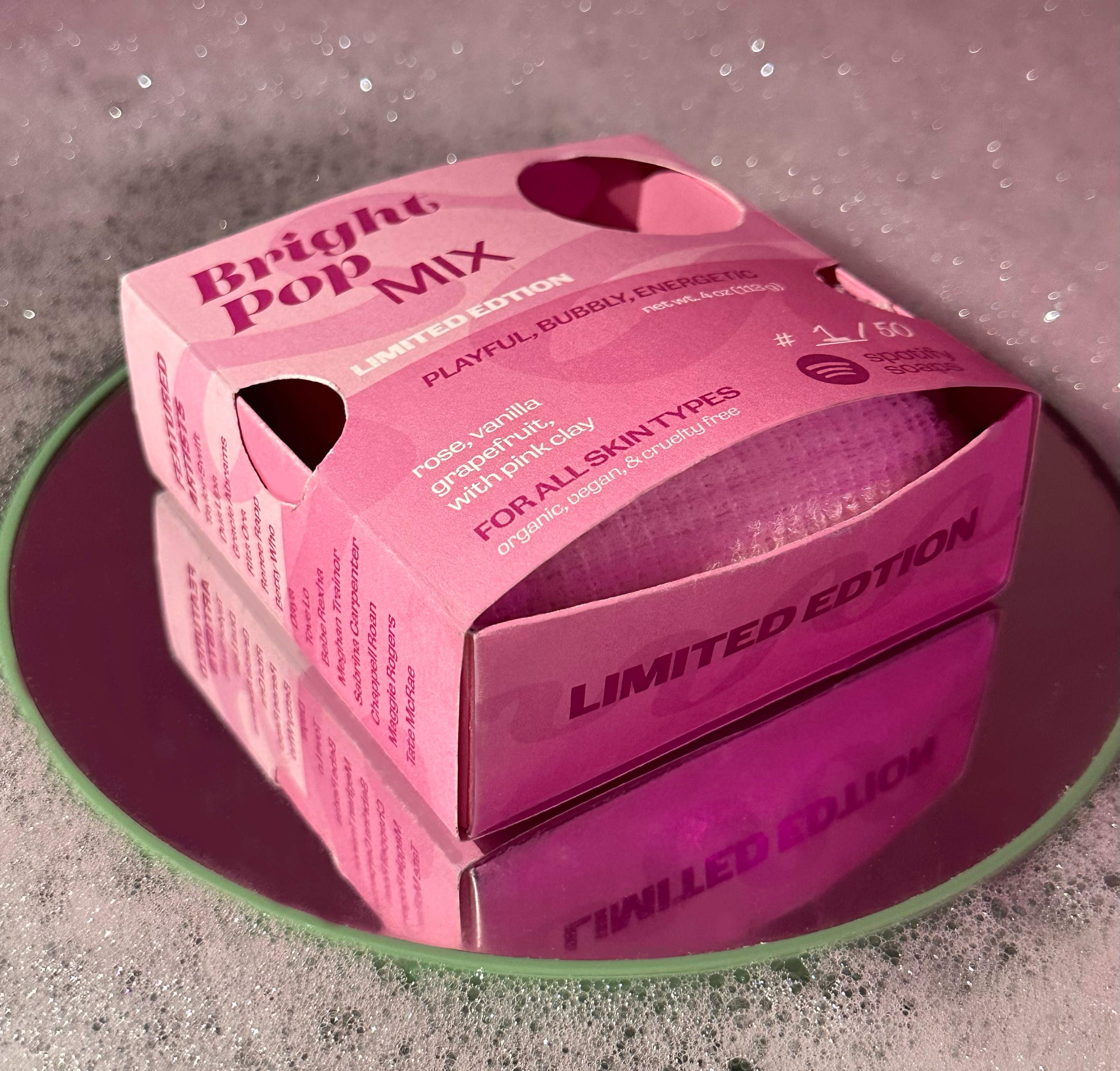
This conceptual project reimagined soap packaging as a multisensory experience by merging music and personal care. The goal was to design five distinct variations of the same product, each inspired by a different music genre and visually expressed through custom color palettes, patterns, and typography.
The packaging system allowed users to select a soap that matched their taste — both in scent and sound — by including an exclusive Spotify playlist and a featured artist section within each box. Visual hierarchy was established through varying type sizes and treatments, creating rhythm across the collection while maintaining cohesion.
Printed on thick, waterproof paper, the packaging was both durable and reusable, designed to unfold into a soap tray. A hand-cut die-cut window added a tactile, playful element to the genre-based identity of each bar.
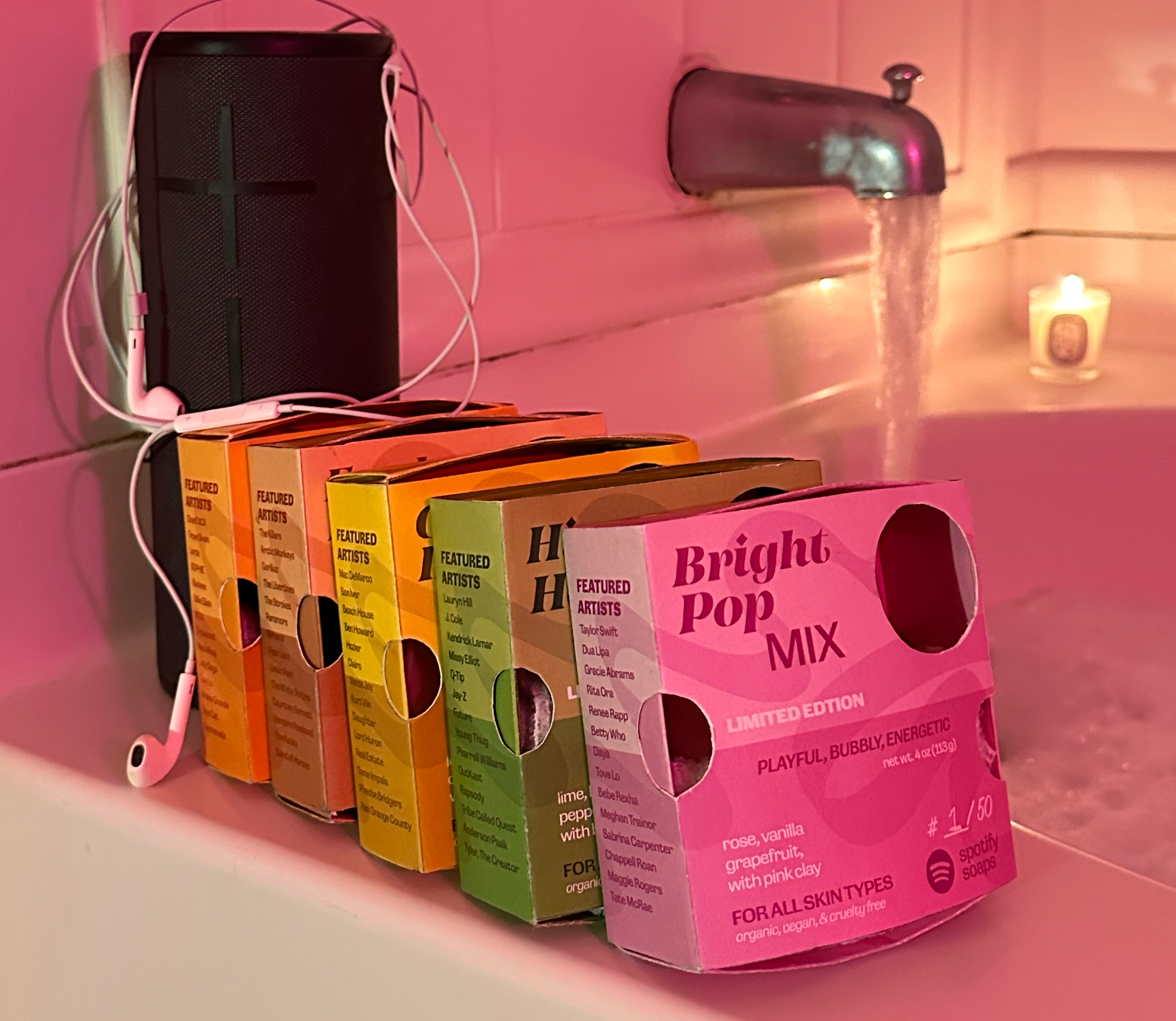
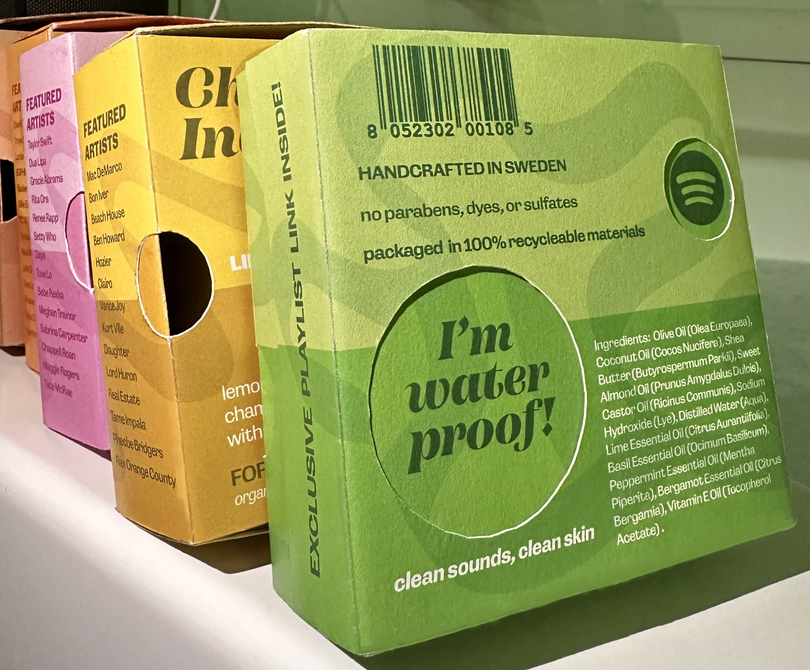
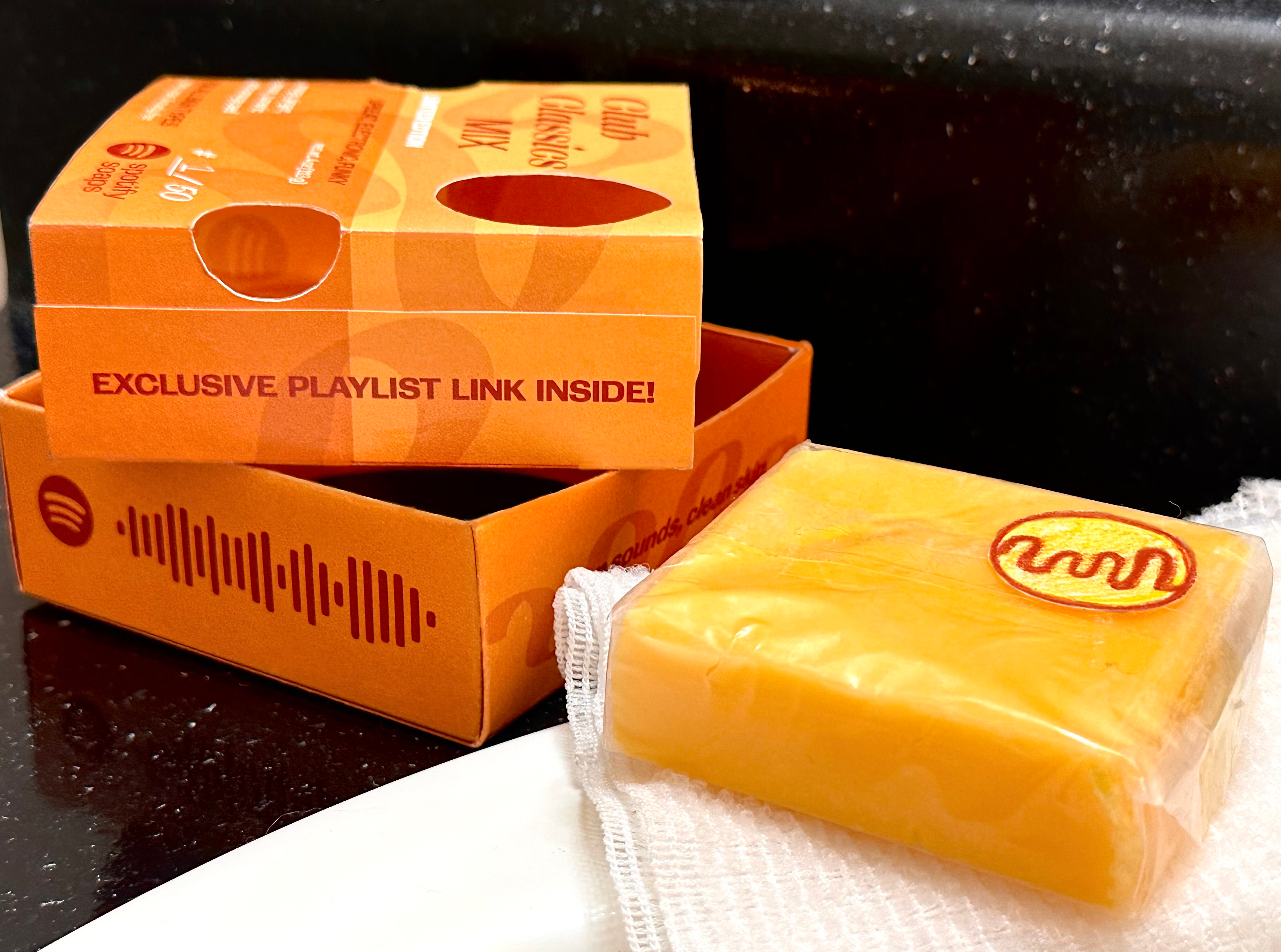
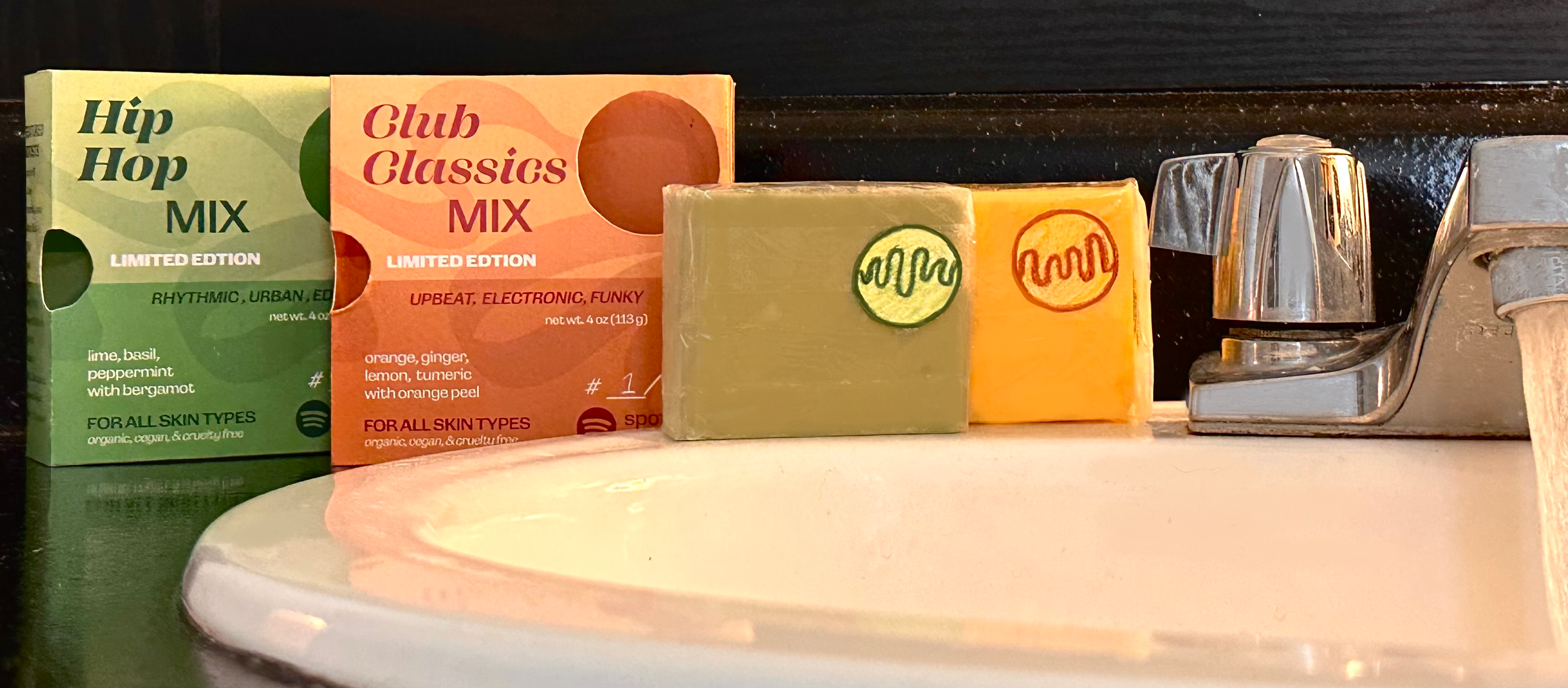
The typography for Spotify Soaps used a playful mix of cases and weights to reflect the personality of each music genre. Lowercase sans-serifs gave off a soft, modern vibe for relaxed scents like indie, while bold, all-caps styles brought energy to upbeat genres like pop. The varied type treatments helped establish visual hierarchy and genre tone, while maintaining cohesion across the collection through consistent alignment and spacing.