04 — Branding · Illustration · Social Media · Print · Merchandise
Camp Rigid
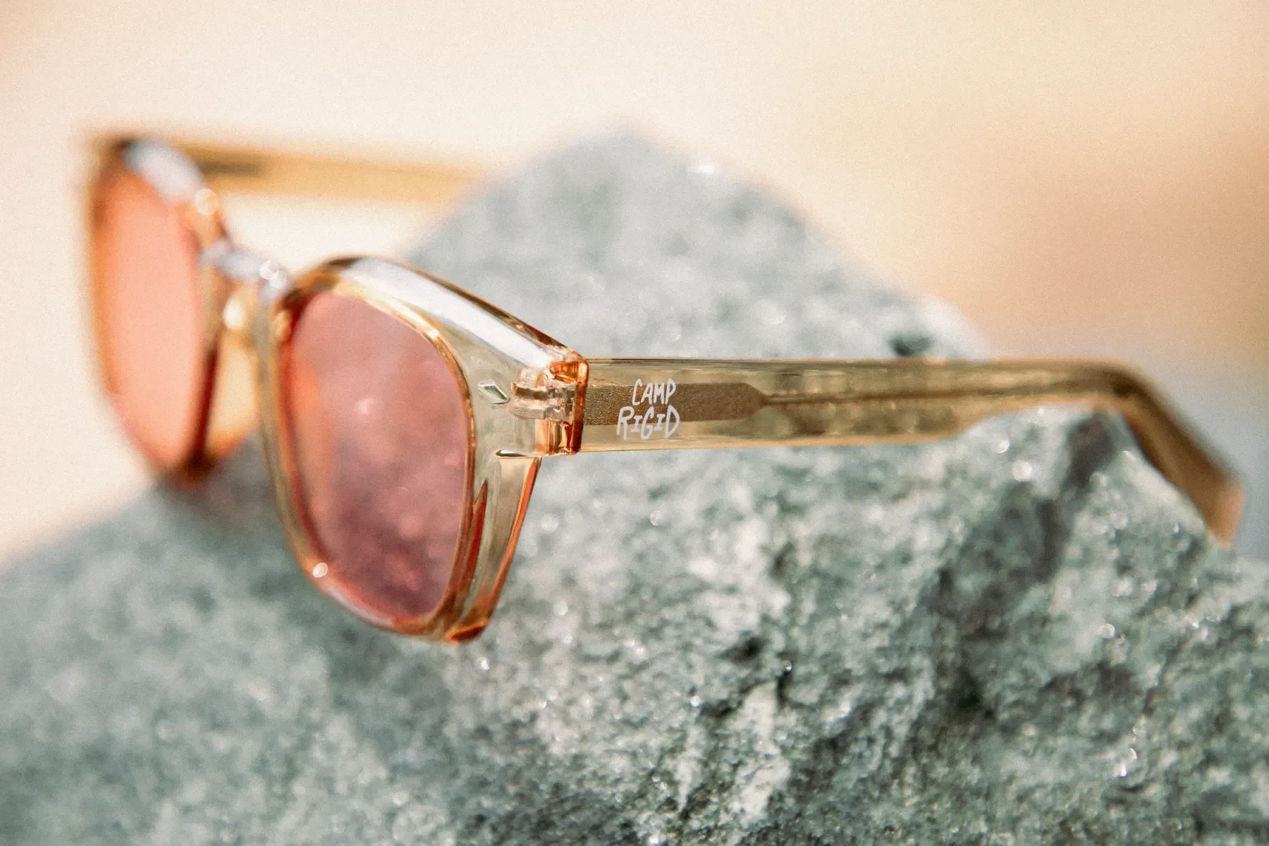
Camp Rigid is a streetwear and product line inspired by summer camp nostalgia and the online personality of "DoctorRigid." The project centered around playful, personality-driven branding applied to apparel, keychains, eyewear, and novelty goods.
With bold graphics, retro-inspired illustrations, and humorous taglines, the brand turns everyday objects into collectible keepsakes.
The visual language leans into limited palettes, hand-drawn textures, and whimsical motifs like log cabins and starlit skies to evoke memory and familiarity. Each product encourages interaction and connection through its charm and design sensibility.
Brand identity
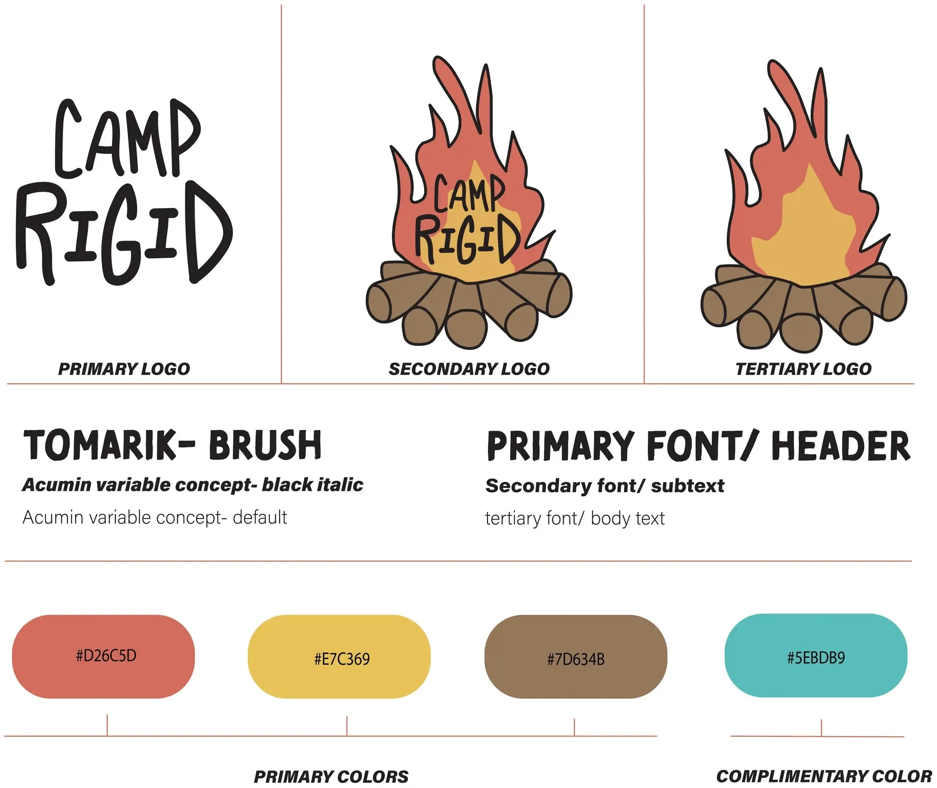
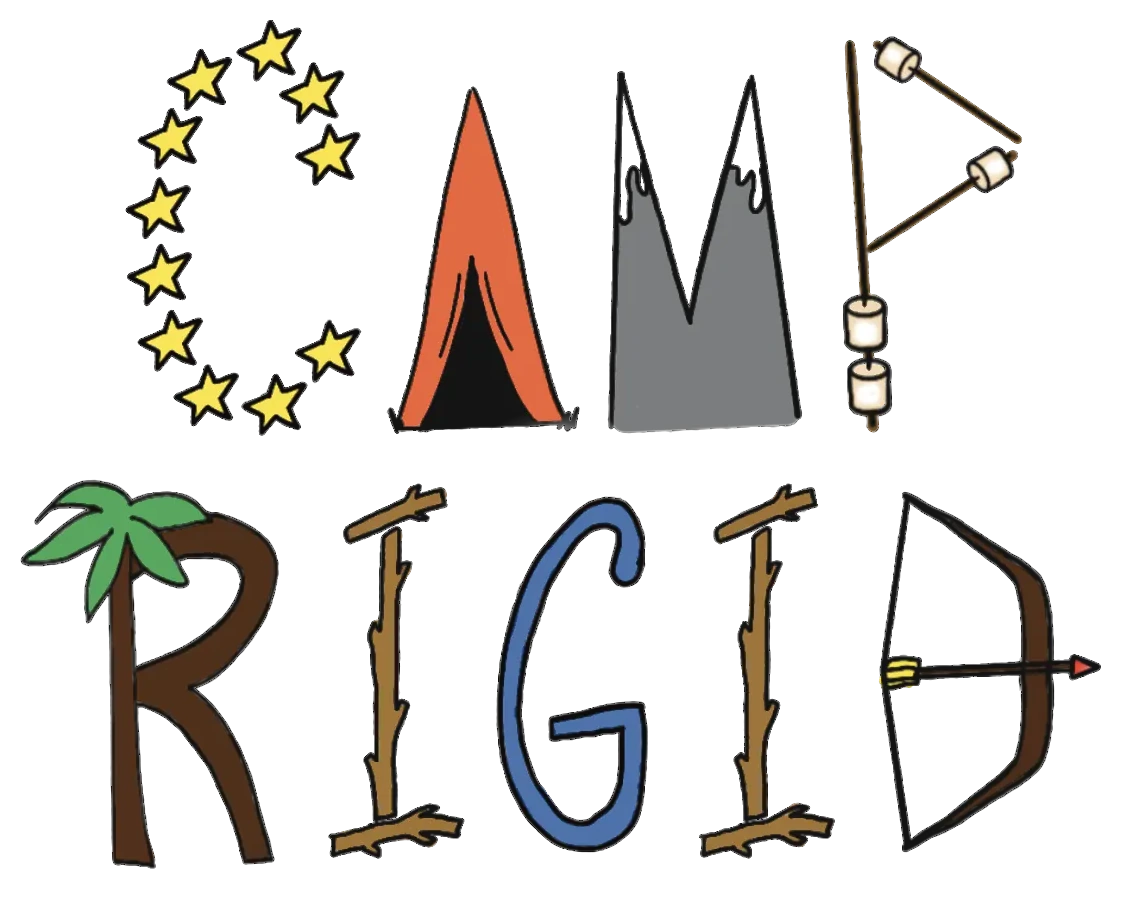
I created the Camp Rigid brand identity from scratch: the logos, the type system, and a palette pulled from campfires, canvas, and lake water.
 Open the full image
Illustrations
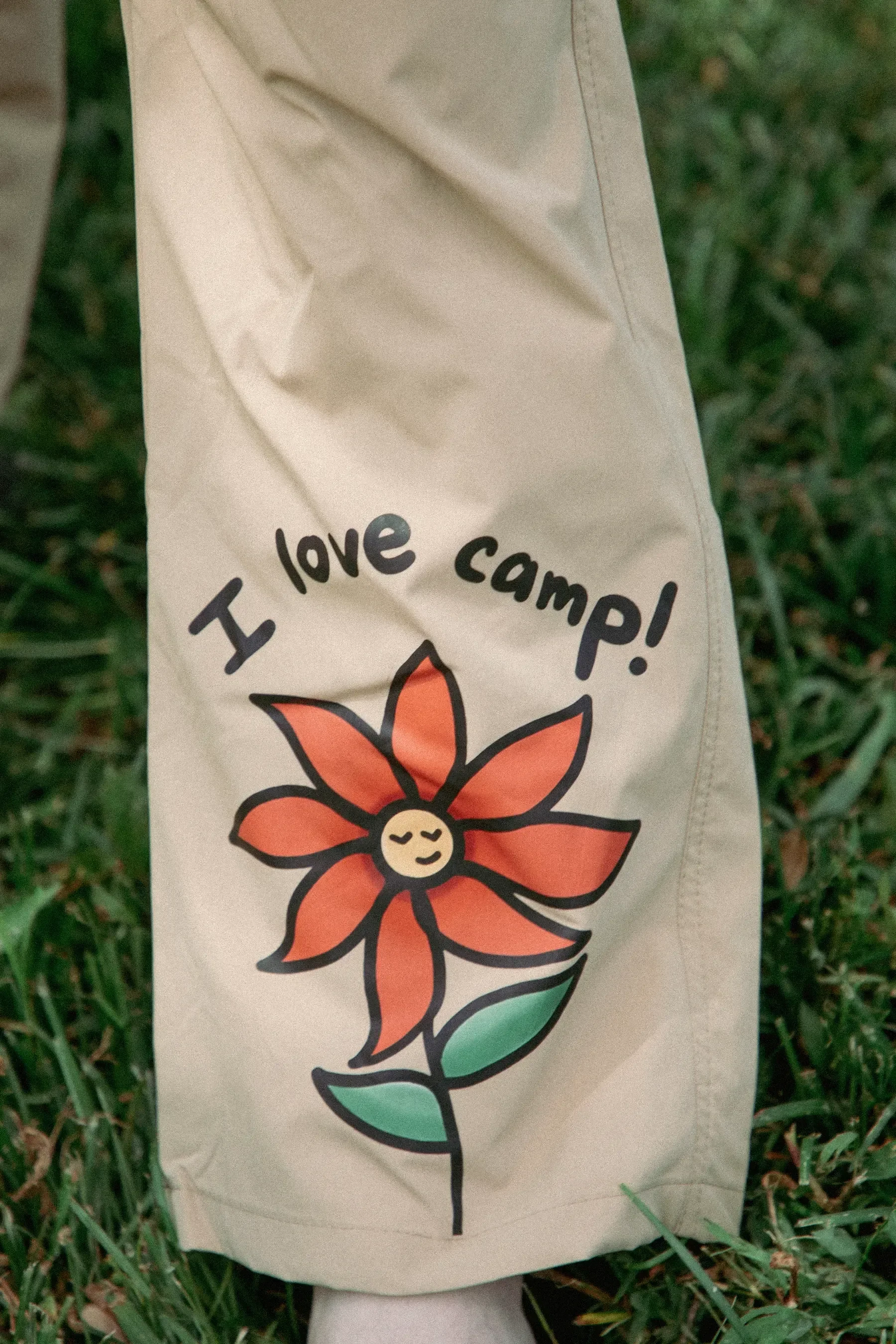
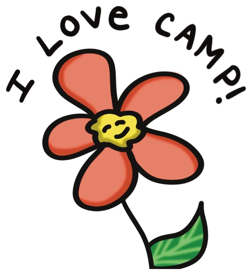
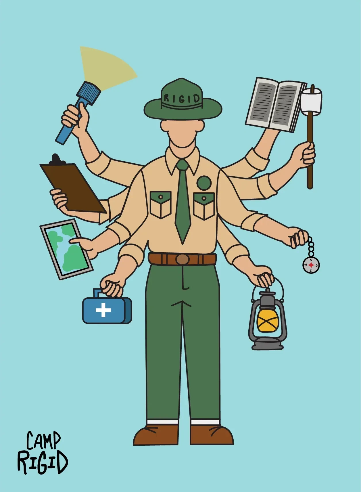
I drew a set of illustrations to bring the brand to life and give it a hand-made, summer-camp personality.
 Open the full image
 Open the full image
 Open the full image
The bundles
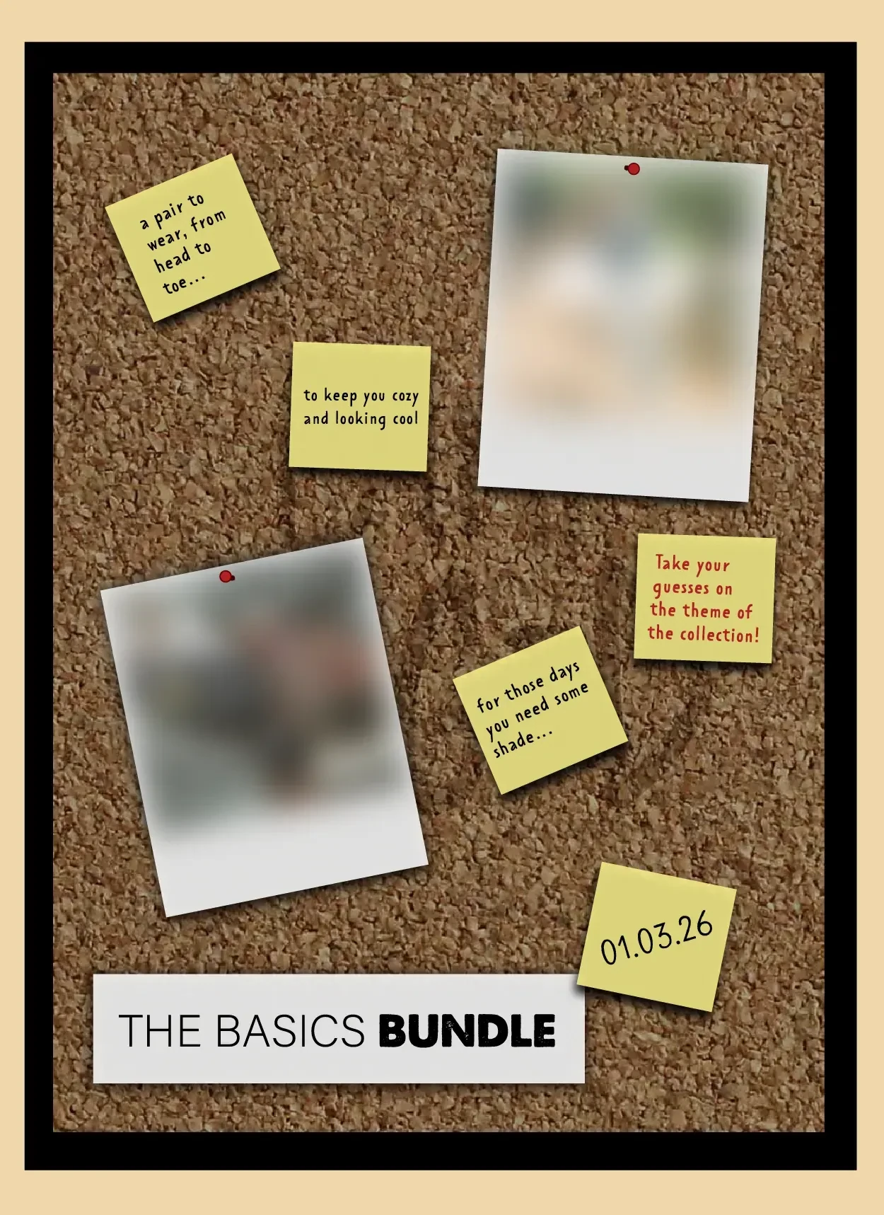
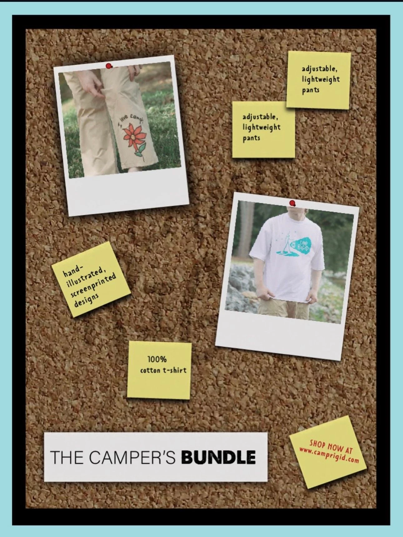
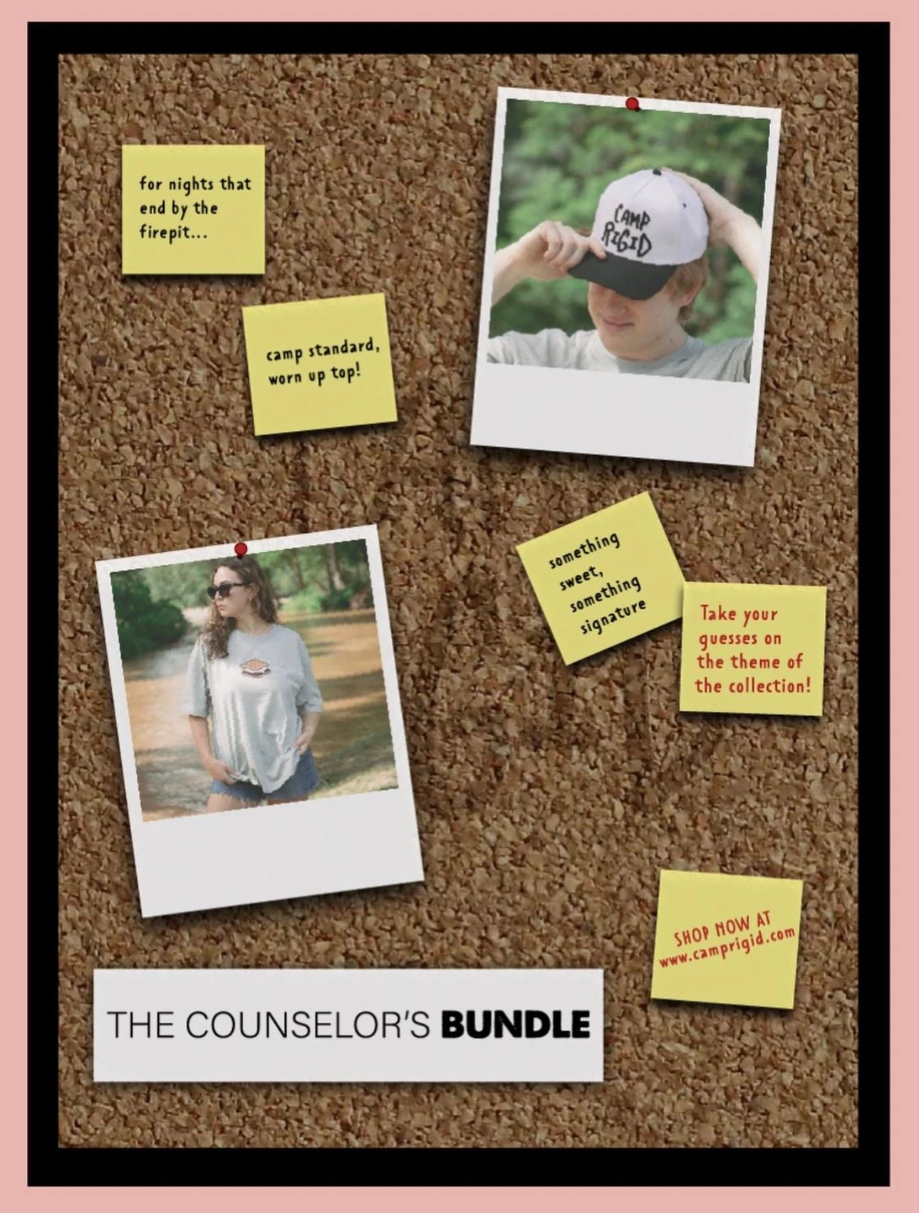
Each bundle got a corkboard and a few product cards, so the pieces read as a set.
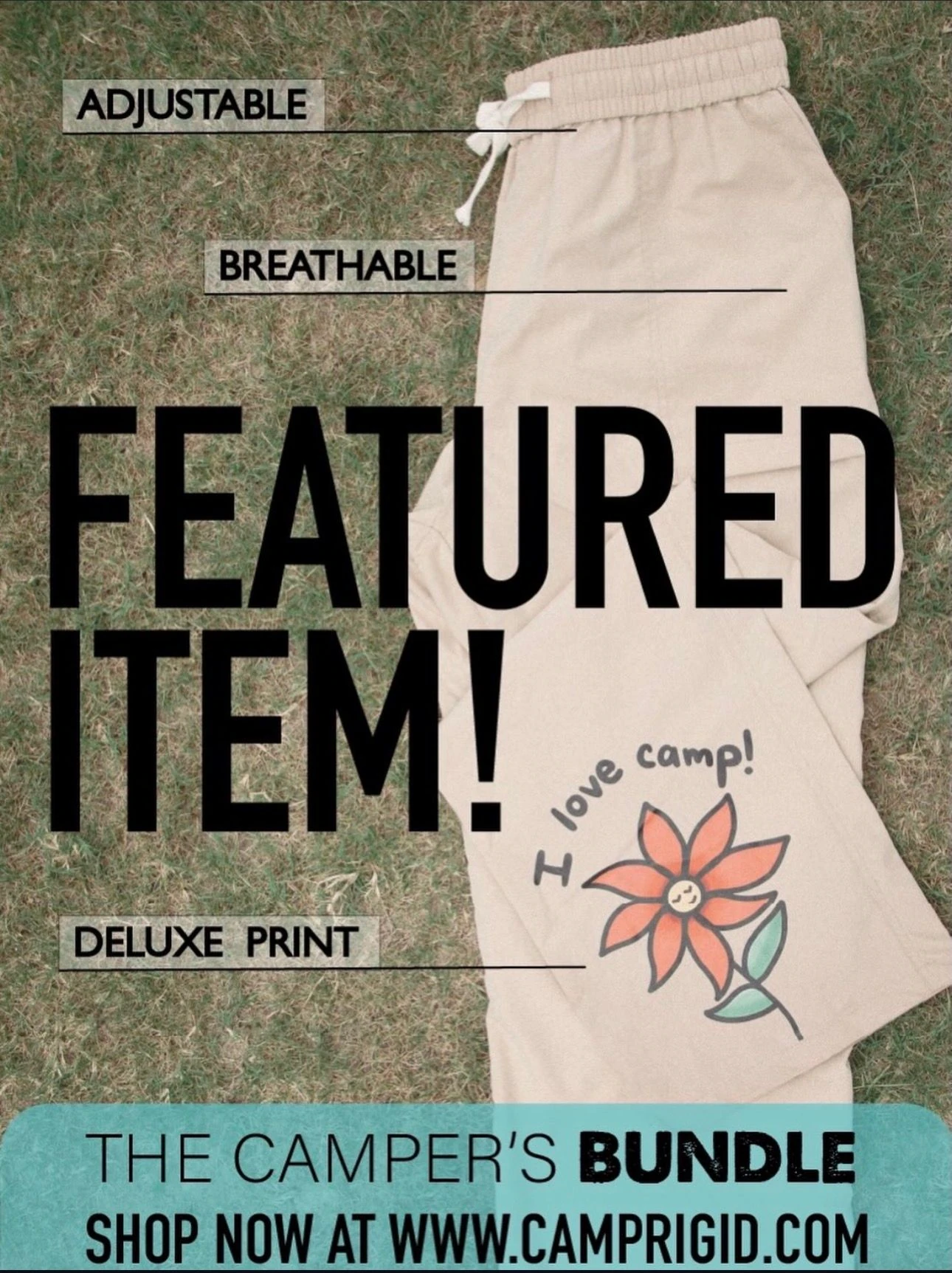
The Camper's Bundle
 Open the full image
 Open the full image
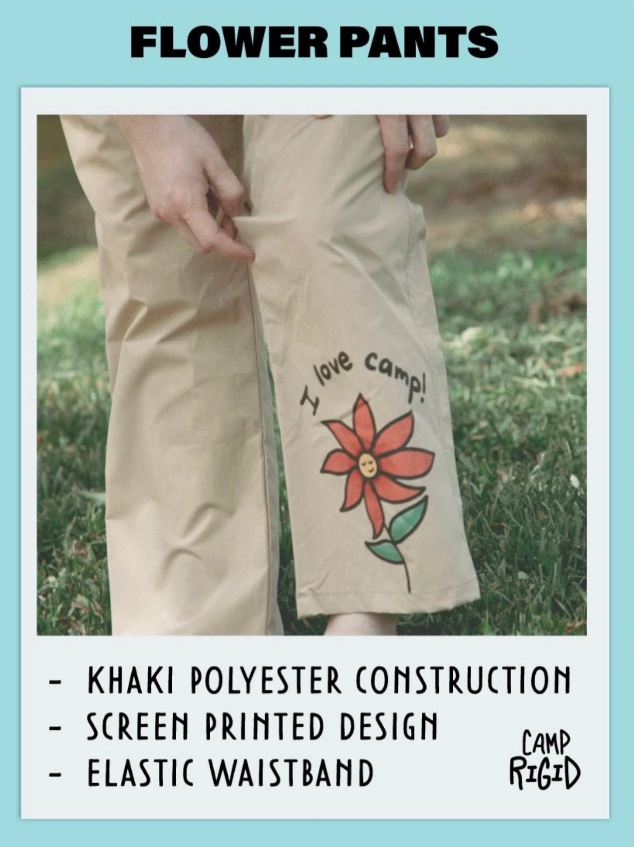 Open the full image
The Basics Bundle
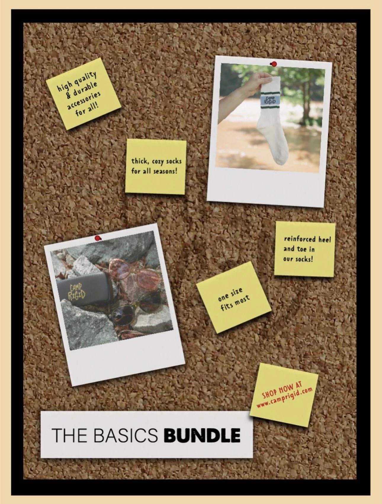 Open the full image
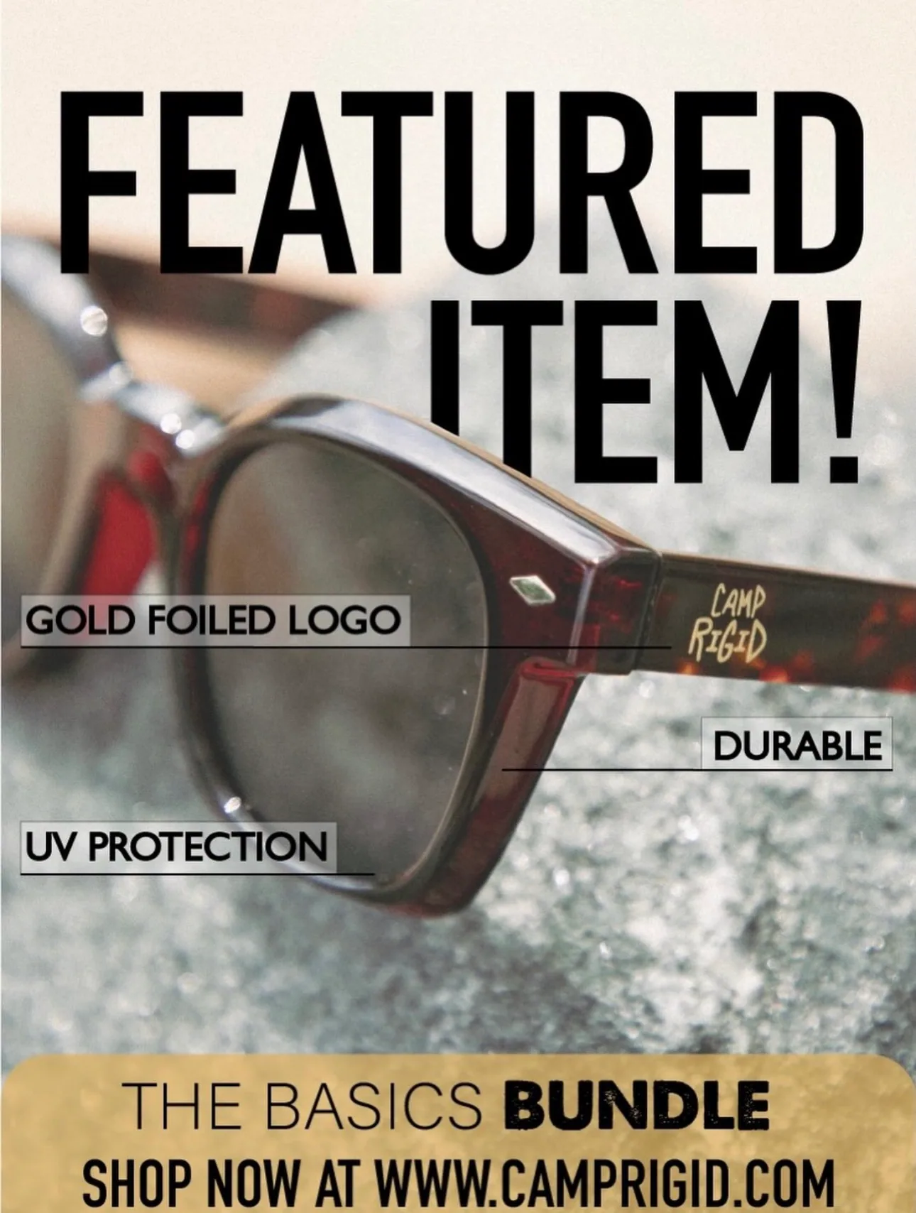 Open the full image
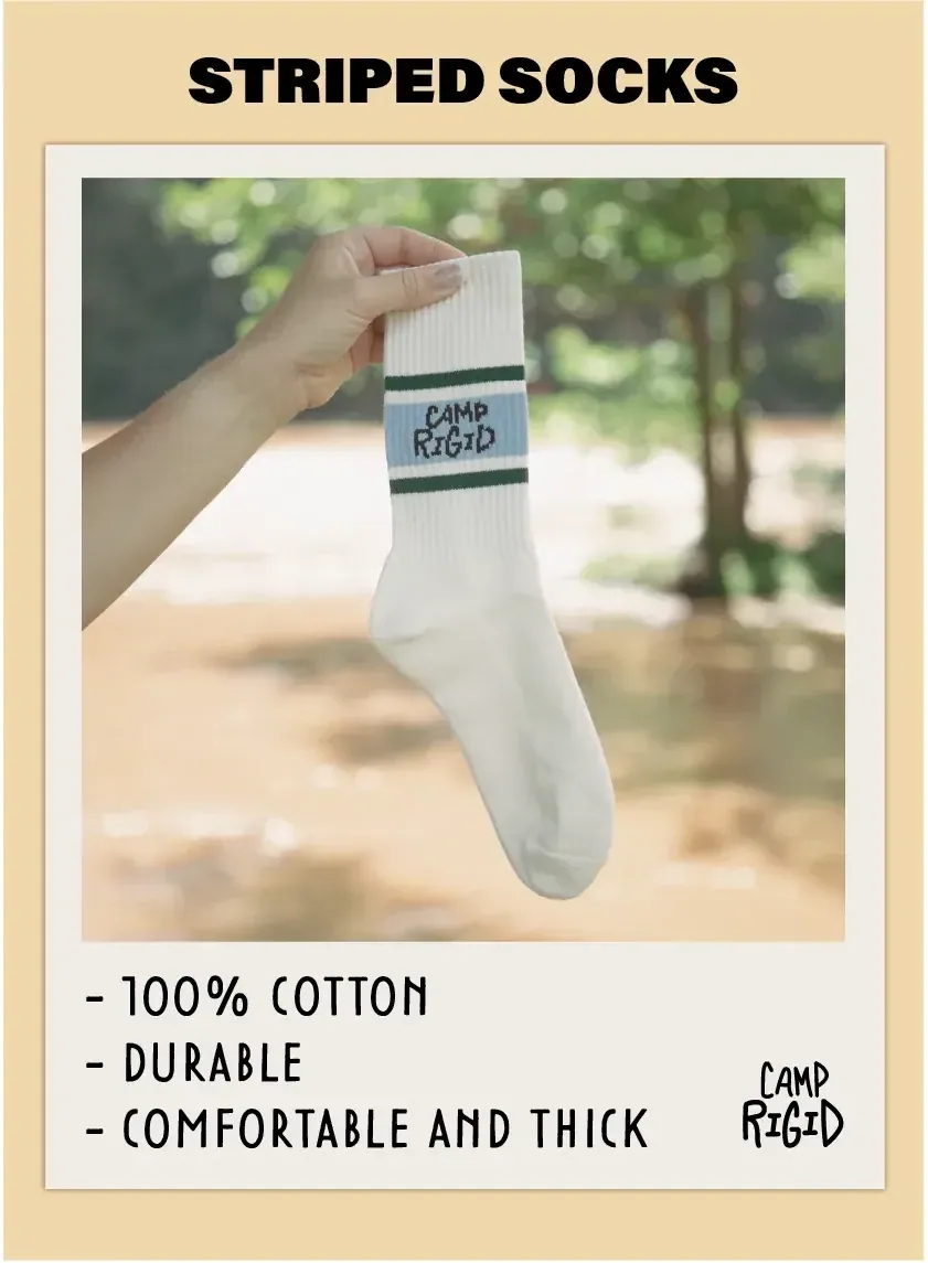 Open the full image
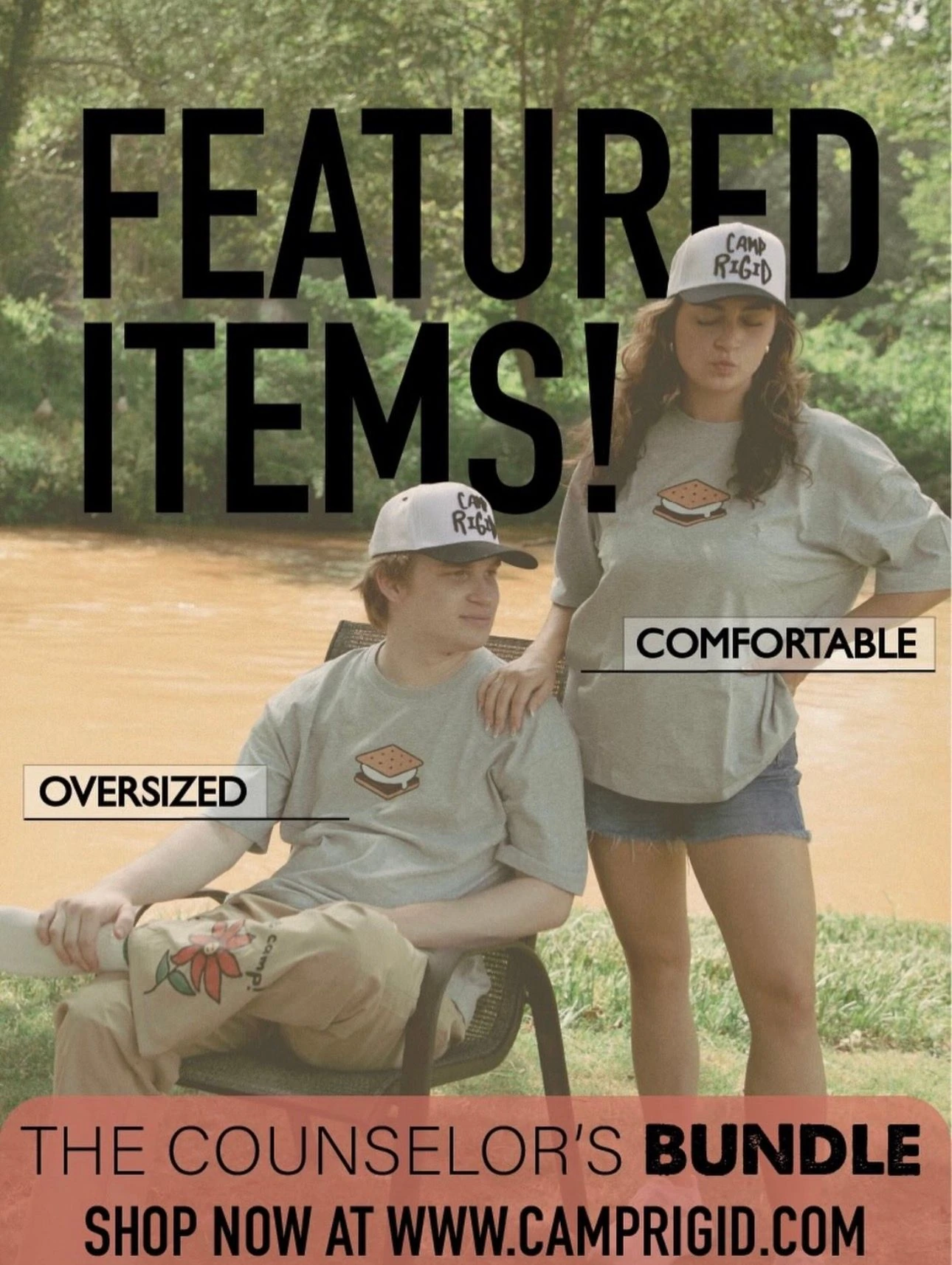
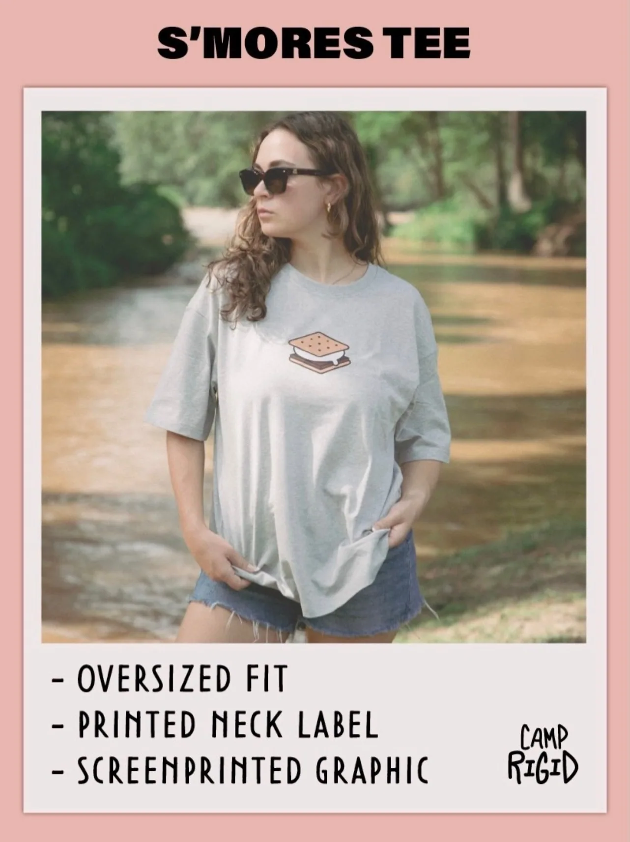
The Counselor's Bundle
 Open the full image
 Open the full image
 Open the full image
The pieces
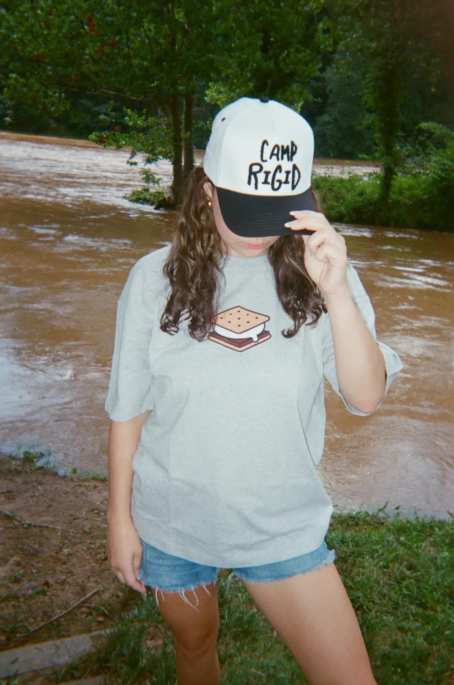
I put the graphics on the pieces themselves: a cap and tee by the river, sunglasses, and the flower illustration printed on a pant leg.